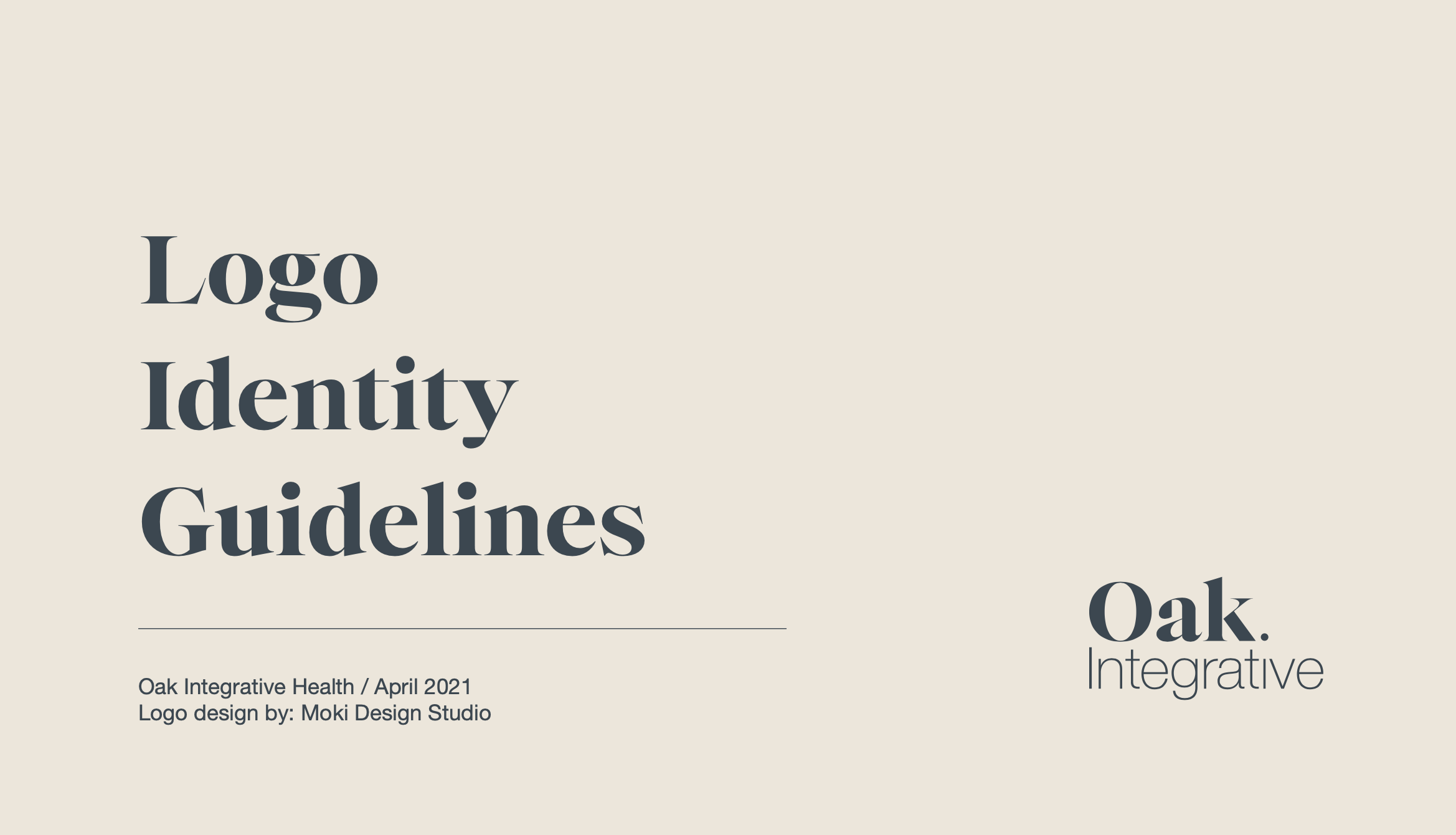

Oak Integrative Health
Client Overview: Oak Integrative Health is a wellness brand that needed a logo to encapsulate its mission of holistic health, unity, and integrative practices. The goal was to create a unique logo that combines a creative play on their brand name with a visually minimalistic design.

Project Goals:
To create a logo that visually represents the brand’s name, mission, and values.
To convey the concept of “integration” creatively, incorporating visual cues to emphasize the brand’s holistic approach.
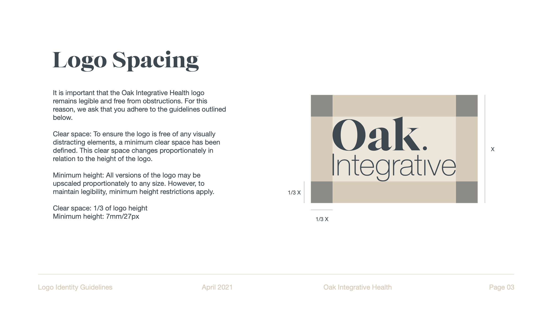
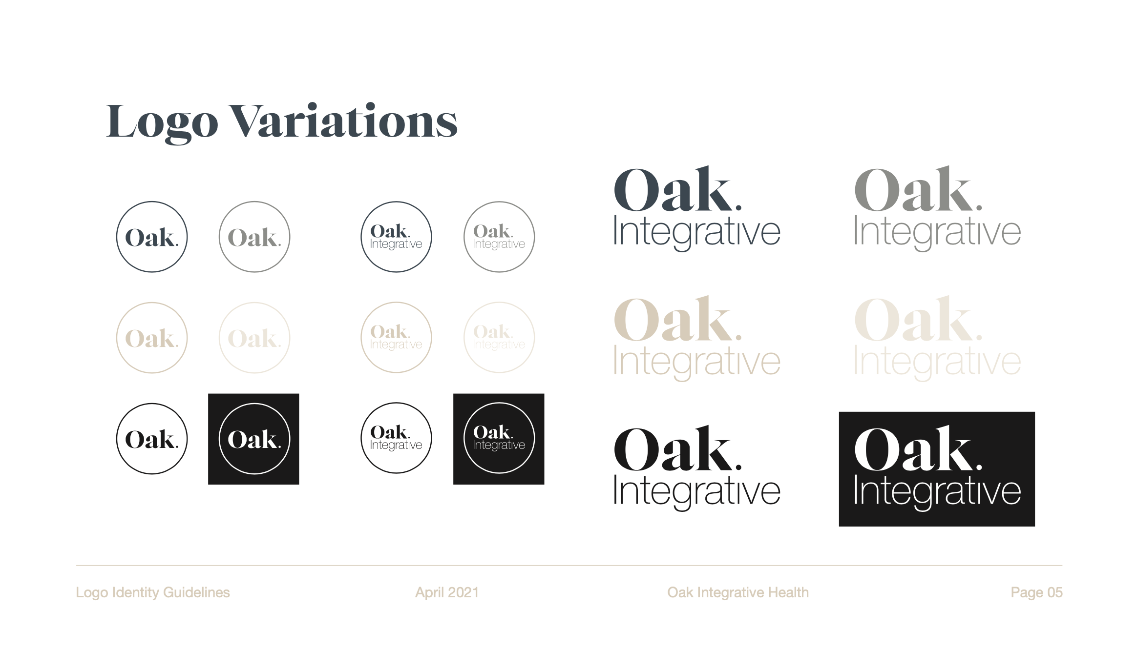
To ensure the logo is minimalistic, scalable, and responsive across various applications.
Word Play Integration
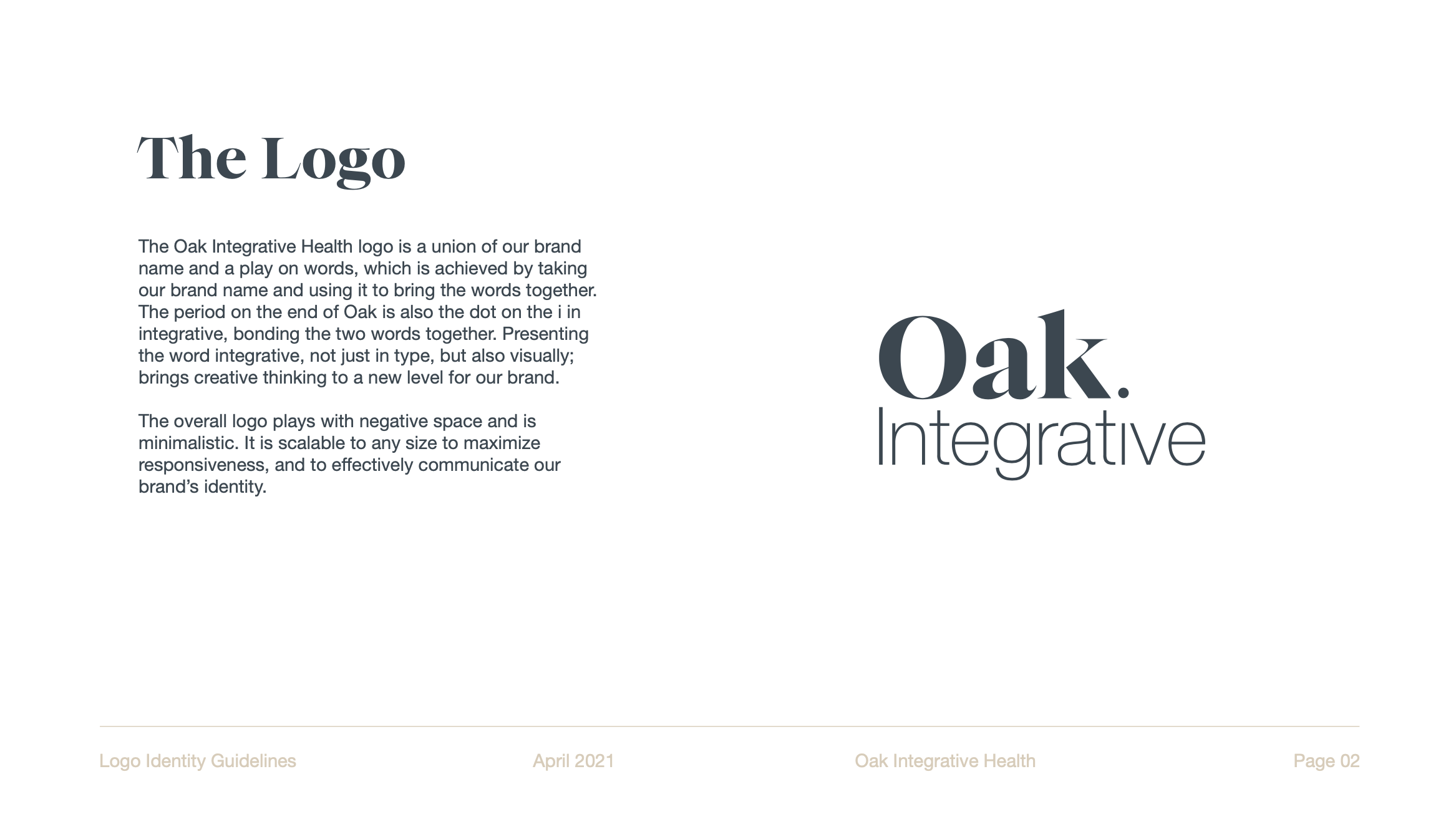
The logo creatively combines the brand name "Oak" with the word “integrative,” using the period at the end of "Oak" as the dot for the “i” in "integrative." This technique ties the two words together, symbolizing integration.
Visual Representation
The logo visually portrays the concept of integration, going beyond text alone and into a creative representation of the brand’s core value of unity.
Negative Space & Minimalism
Utilizing negative space and a minimalistic style, the logo maintains a clean, modern look that is not only aesthetically pleasing but also adaptable for various uses.
Scalability & Responsiveness
Designed to be scalable, the logo is effective across all digital and print mediums, maintaining clarity and impact at any size.
Tone words
Minimalist
Clean
Fresh
Elegant
Project Outcome
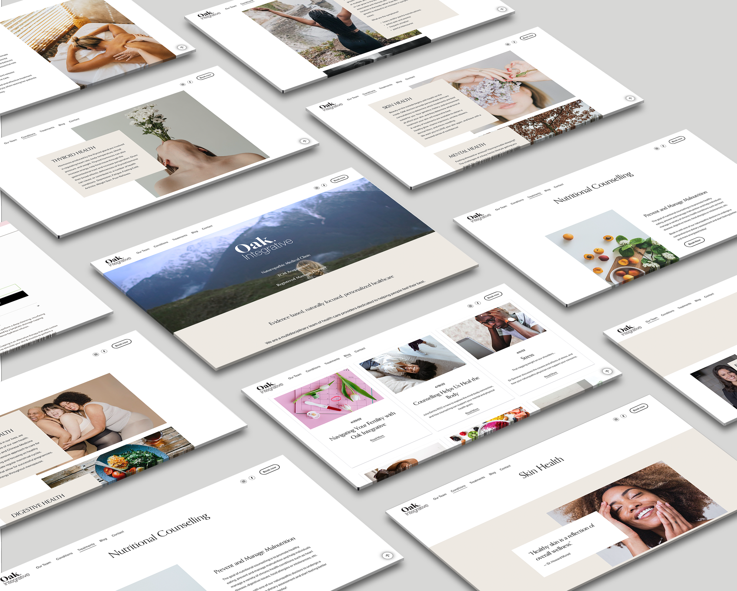
The Oak Integrative Health logo successfully captures the brand’s identity and conveys a sense of unity and holistic integration. The logo's thoughtful design communicates the brand's mission with simplicity and sophistication, standing as a memorable and functional symbol that aligns with Oak Integrative Health’s values.